Built for the Group Chat: Five Posts That Earn a Screenshot
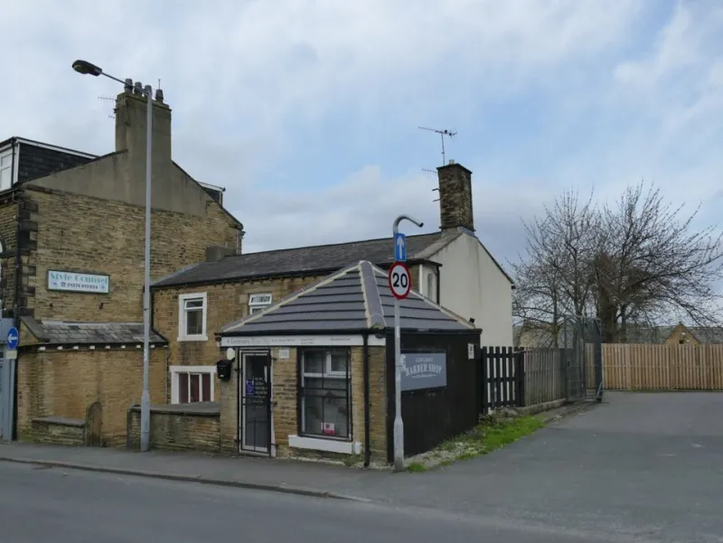
Photo: Stephen Craven , CC BY-SA 2.0, via Wikimedia Commons
Most social media advice chases the visible stuff: likes, comments, shares, saves. For a small UK business, there is a quieter signal worth watching. Did someone screenshot the post and drop it into a WhatsApp group? That is distribution without ad spend. It is also a different job from entertaining the feed.
Public engagement is performance. Private forwarding is utility. A post built for the group chat has to survive without your caption, in a thread, next to someone asking: 'Any idea what time they open?' If it cannot answer that on its own, it is not ready to travel.
Think of it as the digital equivalent of the card in the co-op window or the notice pinned by the till. It is not there to be admired. It is there to be read, photographed and sent to somebody who needs it.
Start with the pocket test
Before you design another quote graphic or behind-the-scenes reel, run the post through five quick checks:
- Can I read the important bit on a phone at arm's length?
- Does it answer one clear question?
- Does it still make sense without the caption?
- Is the business name, logo or postcode visible?
- Is the useful information dated, or clearly evergreen?
If it fails two of those, redesign it. The best forwarded post is not the cleverest one. It is the one that saves the recipient a phone call.
1. The opening-hours card
Opening hours are boring right up until someone needs them. A clean hours card is one of the most portable things a UK small business can post: seven days, large type, clear exceptions. If the kitchen closes earlier than the shop, say so. If last entry is thirty minutes before closing, put it in. If you are shut for a staff training morning, make that the headline rather than a footnote.
Use a vertical shape, strong contrast and plenty of margin. Add the postcode in the footer. If the hours are temporary, date the card: 'From Monday 16 November' or 'This week only'. That one detail stops an old screenshot becoming a customer complaint.
2. The 'what's on this week' snapshot
Markets, classes, late-night shopping, repair cafés, tastings, kids' workshops: a weekly snapshot gives people a reason to forward the post to someone else. Keep it to one screen. Three to seven entries is plenty. For each one, include the day, time, price and whether booking is needed.
This format works because it does two jobs at once. It tells your followers what is happening, and it gives a local Facebook group something genuinely useful to share. Do not bury the details in a long caption. Put the information in the image, then use the caption for a short human line.
3. The 'finding us' card
If you have a studio, a market stall, a pop-up or a shop tucked off the high street, make a card that answers the navigation questions people ask before they visit. A simple map pin, the postcode, the nearest bus stop, where to park, whether the route is step-free, and any doorbell or side-entrance instruction. If you are dog-friendly, say so. If there is no loo, say that too. Small practical details are exactly what gets screenshotted and sent to a friend.
This is not glamorous content. It is the sort of post that quietly removes friction and makes a first visit more likely.
4. The plain-price card
'DM for prices' is a conversion killer in a group chat. If a customer has to ask, they cannot forward your post with confidence. A plain-price card does not need to list every option. It can show a starting price, what is included, the deposit and the typical turnaround. A repair shop can list a standard service from a set price. A salon can show a cut-and-finish starting rate. A bakery can explain a celebration cake deposit.
Keep the terms short and the type large. The aim is not a full price list. It is enough information for someone to think: 'This is the place I was telling you about.'
5. The short-notice update
Sometimes the most shareable post is the least polished one. A closure due to staff sickness, a sell-out, a changed delivery day, last orders before a holiday: these updates need to be fast and unmistakable. High contrast, plain language, date and time. No clever wordplay. No tiny text in the corner.
When the situation changes, update or delete the post. A forwarded screenshot of an old closure notice is worse than no post at all. Short-notice updates are a trust exercise. Get them right and people learn that your feed is worth checking when it matters.
Make it portable without making it ugly
A few design habits help. Use a 4:5 or 9:16 shape that sits comfortably on a phone. Keep text out of the busy part of a photo. Leave safe margins so the screenshot does not crop the important bit. Put your name or logo somewhere visible but not shouty. Export a proper image rather than relying on a story that disappears.
And do not hide essential information in the caption. The image should carry the message. The caption can add warmth, context or a nudge: 'Screenshot this for later.' That line is not a gimmick. It gives people permission to do what they were already inclined to do.
Where to point the effort
Not every post needs to be a utility card. Two or three a week is enough for most small businesses. Use them for the questions you answer repeatedly at the counter, in DMs and on the phone. Keep the tone human. A noticeboard works because it is selective. One clear notice beats six cramped flyers.
Measure the quiet share
You cannot track a WhatsApp forward the way you track a click. But you can look at saves and shares, DMs that begin with 'someone sent me this', and new customers who mention a group. Ask at the till how people heard about you. Add a simple line to your post: 'Found us through a group? Tell us.' The answers will tell you more than a like ever will.
Likes are nice. A screenshot is a customer doing your distribution for you. Build posts for the group chat and you are not just broadcasting. You are giving people something useful to pass on.